Monday, April 21, 2014

it's the final countdown

When Michael Shaw announced to the class that for our final, we could do virtually anything, I panicked.  An assignment with few boundaries is a frightening thing.  I plan to major in either Graphic Design or Photography, so I knew that I wanted to incorporate elements of both in my project.  

Previous to our info graph, I did research about photoshop artist.  All of the artists that i posted about had outstanding work that interested me.  But none of it incorporated what I wanted to learn how to do with Photoshop.  They all used digital painting, which is about as far away as possible from what I wan tot do with the software.  

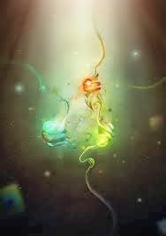
With a major in photography, I would use photoshop to enhance my work.  With graphic design, I would use it to incorporate hand drawn elements, textures, and pictures into graphic works.  So I searched for ideas and inspiration.


Although all of these pieces are beautiful and stood out to me the most out of everything i saw, nothing intrigued me enough to create my own version of something similar.  Which led me straight back to square one. 

-----------------------------------------------------------

About a week ago, I was driving through midtown and I got completely lost.  I knew what street I was on, but it was an area I had never driven before.  Right before I reached familiar territory, I drove through an overpass and noticed a large wall mural.  It was very simple with lots of potential to add elements in Photoshop.

When I first saw it, I knew that one day I would want to do a photo shoot there.  Little did I know how soon the opportunity would arise.  

I realized this would be the perfect location to take a few pictures to photoshop.  I plan on having my roommate model for me within the next couple of days.  


I have also been wanting to design a logo for myself.  Something simple that I can easily stick on digital copies of my work.  This will be where I incorporate a graphic design element.  

-----------------------------------------------------------

The Assignment Requirements

A layer mask
Marquee tools
Clone Stamp Tool
Burn and Dodge
Adjustment Layers 
One scanned in element
One element created purely in photoshop

-----------------------------------------------------------

Plan of Action

A Layer Mask: I will use this to put a slight hue over the background of the image to make the figure stand out.
Marquee tools: I will use this to select different ares when I am applying the layer masks.
Clone Stamp Tool: I will use this to give the subject flawless skin, typical clone stamp use.
Burn and Dodge: I will use this to high light the subject and to create darker shadows. This is the tool that I am most excited about experimenting with.
Adjustment Layers: I will use these to adjust the photo to make it look as good as possible.
Scanned in Element: I will scan in a fabric and either add it to part of the picture or I will give the logo a texture with the fabric.  
Element Created in Photoshop: The logo will be created purely in photoshop.

Tuesday, March 18, 2014

Phenomenal Photoshopping

Shadow Chen

She is a mixed media Illustrator from Ningbo, Chine.  She has majored in industrial design, and is alb art and design postgraduate.  Her love for art pushed her to explore more avenues as an illustrator and graphs designer.  Her works are always seen in liquid forms, with a traditional twist and bright colors.  Her professional specialization as a freelance artist includes Illustration, Graphic Design, and Web Design.

Based off her work, I hope to learn how to make digital work look like it belongs on a canvas.  I want to learn how to make a digital print appear to be water color. 


Igor Scekic


Tiago Hoisel


He is a freelance artist in Sao Paulo, Brazil.  


"During college that direction didn’t change and I continued to focus on humorous illustrations more than the graphic design itself."

From his work, I want to learn how to challenge myself to take real like and turn it into a wild cartoon.  He warps reality to make people, animals, animals into comical characters.


David Fuhrer


Erik Jonsson


Thursday, March 6, 2014

I know a whale joke. It's a real killer.

Once upon a time, a digital foundations teacher said to fifteen clueless student "today class, we are going to begin designing a template for our three dimensional characters!"

Everyone starred blankly. 

But sir master teacher, this is a digital class…..

The teacher claimed that argument was invalid and therefore, the students must struggle forth and make a three-dimensional character out of paper. 

At first, I wanted to make my character fly. I decided to make a bird. I would then mount this bird on a flywheel, pull the trigger, and it would fly.  However, that idea completely failed once tested.  So I thought that if I can't do a creature of the sky, let's go as far down as possible and make a sea creature. 

Who doesn't love a cute cartoon whale?

Give that fellow something to smile about and everyone will love him. 

This is why I created Wallace.

Wallace is a purple whale cheesin' away at life.  He is thoroughly amused by the water coming out of his blow hole.  But sadly, he's kind of an air head.  

I am pleased with the way Wallace came into this world and how he remains to be. 

 ~MAJOR Inspiration~


Wallace coming into the world.


And the final result….


Penguin F150 by Beth Allen
Little Man by Darion Beasley

Lord Squanderfield by Nick Nelson


Tuesday, February 18, 2014

Seventeen Hours and a Selfie Later

When first given this project, Michael showed us a few examples.  I was very unimpressed by what he showed us.  Everything was bland, lacking detail.  There was too much left open to interpretation.  I knew I wanted to make my self portrait as detailed as possible.  

We had two guidelines:

1. Make a 8.5" x 11" self portrait. 
2. Only use the rectangle tool in Adobe Illustrator.

Sounds easy enough, right?


WRONG


I have dabbled in Photoshop and Illustrator in the past, so I thought that this would be a walk in the park. Psh, was I ever wrong.  I didn't realize how little I knew about Illustrator until I got about third seconds into the project.

So I looked around at my classmates and how they were doing it.  I listened.

*click click click click click*
*click click click click click click click*
*click click click click click click*
*click click click click*

Everyone around my was creating tiny little rectangles to creating light and shadow to make a million shapes form a face.  I thought to myself that making thousands of rectangles would go by quickly. Once I reached the ten hour mark and my face was still incomplete, I knew I wasn't going to bed that night.

Sure enough, click, drag, release, repeat x 100000000000 took a solid seventeen hours.  

However, I fully achieved my goal.  

I wanted the viewer to know that this was not a normal self portrait, that there must be something slightly off about this person.  But, I also wanted it to be absolutely clear that this was in fact my face.  The details in the T-zone translate that it is me, but the "larger" rectangles on the cheeks and neck and shirt give it a pixelated look.


Thursday, January 30, 2014

Big City, Big Problems

Gestalt Principles

For this project, I struggled at the beginning to come up with an idea.  I walked around the class as everyone else was wall on their way to a strong project.  I began thinking what causes are relevant in my life.  

I have lived in Memphis since 2002.  Although Memphis is not a fancy city like New York or Chicago, it contains many of the same issues that larger cities have.  Throughout middle school and high school, I was very involved in a youth group.  Every summer, we spent a week in midtown at a church where we put on a Vacation Bible School for kids in the surrounding neighborhoods.  During this week, we would also go and do service projects, such as cleaning up trash. Because of the summers I spent in the heart of Memphis, I am well aware of the undying problems in cities.  

Since the problems that Memphis has are also in other big cities, I began trying to figure out how to turn this into a project.  After thinking about it, I realized that all of these problems are things that no one wants to take time to deal with. 

Air Pollution.  
Unemployment.
Litter. 
Homelessness.

Next came the composition.  Obviously, I needed to have a city skyline.  After searching for the perfect one, I decided to create my own.  For inspiration, I used the skylines of Los Angeles and New York.  

To show air pollution, I new I wanted to have a cloud of smog behind the buildings.  

For litter, I placed a tipped over trashcan with garbage falling out everywhere.  

Last but not least.  The homeless man.


Reference Photos


Sadly, I did not achieve all my goals that I had intended with this project.  If I were to revisit this piece, I would first start with the car and completely redesign it by making it proportional to its surroundings.  Secondly, I would use a tablet to handwrite the message on the sign.  And lastly, I would make the smog a discrete intricate pattern, possibly out of words describing what the viewer is looking at.